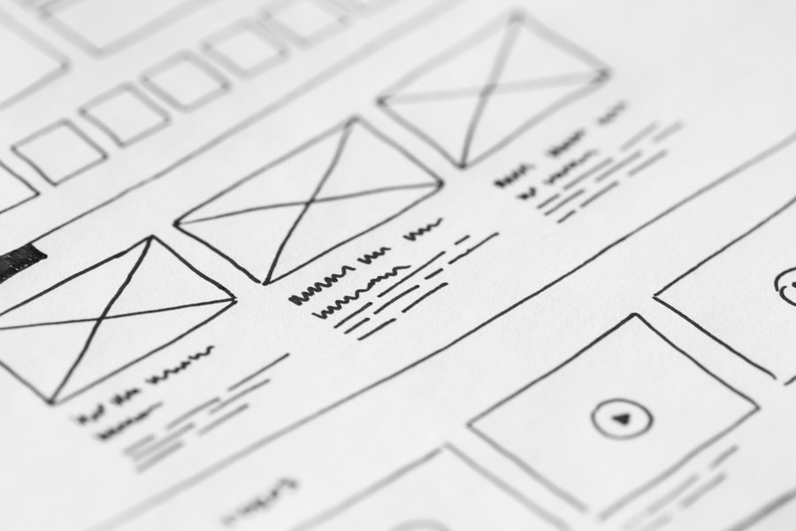
These days, when everything happens online, your website is your salesman 24/7. That's why your website's user experience is the first and most important thing you should focus on. A business website or app can leave a lasting impression on a customer. And, of course, you want it to be a good one. If users have a positive experience on your site, they’re more likely to convert into customers. If users are engaged and enjoying their experience on our site, they’re less likely to click away or “bounce” after just a few seconds. We are now talking about the User Experience which is a major game changer.
How to Improve Your Website’s User Experience
As a web design agency we are watching digital trends evolve in rapid speed. Every trend can make your website feel old or outdated. While sometimes only redesign can help, you may not have the time or resources to invest in such a massive project. To help you with this challenge, we've asked our UX designers and put together a list of 7 simple ways you can improve your website’s user experience.
1. Improve the Page Loading Speed
Nowadays, everything is moving fast. People don't have time (or patience) to wait on the screen if your website takes minutes to load.
“As page load time goes from one second to 10 seconds, the probability of a mobile site visitor bouncing increases 123%.” says Google in its latest research. You can check you site score with Google official tool: PageSpeed Insights All you have to do is put your website URL and you will get a proper speed analysis for mobile and desktop versions. Accordingly, you can optimize the loading speed of your web page.
Pictures are normally the primary reason for slow page loading. One of the website user experience best practices is to compress all your images before uploading them to your website. This will significantly improve your website’s loading speed.
2. Use White Space
Whitespace or negative space is the portion of a page that is left blank. (It doesn't mean that the space left has to be white, it just has to be free of any elements.) In terms of website design, it’s the space between columns, text, graphics, images,...
This is one of the quickest and easiest ways to enhance your design. Even subtle amounts of whitespace will allow your designs to breathe and look more polished.
3. Responsive and Mobile-friendly Design
In the last few years you could see “mobile first” almost everywhere. It's nothing new. More than half of all web traffic comes from mobile. That's why most webpage designs are presented on mobile first and then edited on classic desktop.
When designing mobile layout, make sure users can interact with a single touch. Also think about how users are holding their devices - know the minimum size for a mobile touch target, which will help you understand the interface goals.
4. Every Page Should Have a Single Definite Goal
Keep it simple. For example, the checkout page should contain only what is needed for the process of checkout. The intent of each page should be immediately understandable. Any additional but unimportant data goes to the bottom of the list.
5. Make Different Elements Visually Distinct
As mentioned in the paragraph before, your design should help users to navigate on your web easily. Help them find whatever they are looking for on the page with minimum fuss. For example, users must be aware of their location on the web or app. You should have navigational tools at hand (side panel or top of the page) with all the important parts of the website easily accessible. Also pay attention to your call-to-action buttons - they need to stand out and be readable - they should always provide a concise explanation of their intent.
And don't forget text readability and eye-friendly design. The readability depends significantly on the colors you use and the contrast between your text color and surroundings. Plus a good readable font plays a big part.
6. Use Pop-Ups Sparingly
Pop-ups can be great to gather visitor information or promote special offers. However, they can also be intrusive and annoying. For this reason, it’s important to use them sparingly. You should only use pop-ups when they're relevant to the user and you're confident that they won't find them annoying. Also you should make sure that the pop-ups are easily dismissible so that users can close them if they are not interested.
7. Use Your Analytics
Once you are done with designing your website, your work doesn't end here. Take a look on each of your pages with analytics. How many visits did you expect on each page and how is the reality? How long are users staying on your website? Are they leaving after a few seconds? Install some tools like hotjar or smartlook to see what users are doing on your website or app. With these data you can see what your weakest points are and what to fix.
Conclusion
Start redesigning your website with users in mind. Keep the aesthetics simple and offer great functionality. Always keep an eye on your website metrics. You'll soon see an increase in website traffic and a decrease in your bounce rate.


